Creative Use of Typography in Print Ads - Speckyboy Design Magazine RSS |

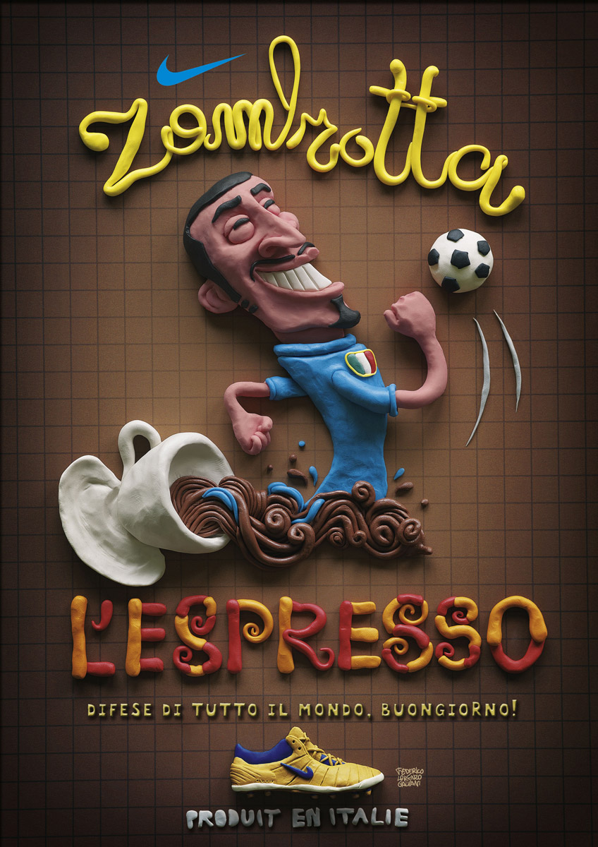
| Creative Use of Typography in Print Ads Posted: 13 Jan 2012 01:09 AM PST When it comes to advertising, what’s being said can be a bit less important than how it’s said. In no case is this more true than in the case of typography based advertisements, which are common in print advertising and gaining popularity even in television and other video mediums. Typography can do everything from adding meaning to drawing attention, and using it right can mean the difference between mediocrity and stardom in the world of advertising. The post below takes a look at some some of the most striking examples of print advertisement’s use of typography scoured from around the world. You may also like: 50 Beautifully Designed Posters with Amazing Typography → Typography as Art → 45 Creative Examples of Typography in the Wild → 50 Examples of Effective Uses of Typography Within Web Design → A Showcase of 35 Beautiful Typographical Illustrations → 45 Stylish and Creative Typographical Desktop Wallpapers → WMF Knives: AppleFlashy special effects are great attention grabbers. We can say this creatively designed print ad makes great use of that fact. The use of typography is truly innovative. Aasra Suicide Prevention Helpline: DepressionYou’ll notice the clever use of visual pun, this is an ideal way for a print ad to say everything in just one image. Webber Wentzel Attorneys: BoxerFrom small text to large and bold text, you cab see with this ad how important typography can be. Nike ItalyCreative and unique implementation of different font styles and color combinations make this ad extremely exciting and memorable. GreenMovie Sound Dept.: Watch the sound, 2Here, you notice loads of typography used for emphasis. Demonstrating that no matter what type of print ad you need to create, you should consider typography an indispensable element of the ad rather than merely text. McDonald’s McFlurry: MonaMix your own McFlurry – Choose between Cornetto, Daim, Kit Kat, Smarties, Caramel, Strawberry and Chocolate Sauce. McDonald’s – I’m lovin’ it. Ben & Jerry’s: GiraffeChoosing a suitable typeface for a project is critical, as is considering the message you would like to communicate, the "consumer" we want to reach and the tone we want to impress. US Preventive Medicine / The Prevention Plan: ScorpionPS2:GirlfriendWe see perhaps an overuse of text in this ad. Different variation of size, style and of course color create distinction where the typography could have been a bit unexciting and monotonous. PS2: Girlfriend, 2Second version of PS2′s girlfriend ad, where we see again an overuse of text saved by variation in size, style and color to create the distinction. Chevrolet SummerSimple and intuitive use of the print ad medium where you can see different color contrast that does a good job of grabbing attention and making this ad stick out. Chupa Chups: Lollypops, 3This creative ad asserts that it’s impossible to get it out of your mouth. This is a cool idea with a beautiful execution! Pivot Boutique: KarmaThe weirdness of this ad makes it memorable. After all, making a lasting impression is what every ad strives for. Coalition to Stop the Use of Child Soldiers: EnglandWith the number of ads that have already been made, originality is hard to come by. This print ad successfully conveys its originality and novelty though. Inlingua – Business EnglishThis is an original print campaign where you can see the designers use of balanced typography to create an illusion. MTV: Happy EndIn print ads, a striking image is great at catching viewers' eyes. However, since it’s an ad it demands that all compulsory text be crammed into the composition, as well. Amnesty International: Ted BundyAnother innovative use of the typography based print ad that stands out mainly because of its extreme creativity. Brighton Language School: EspanolDifferent kinds of ads call for different amounts of text. It’s somewhat surprising to see how versatile minimal text patterns can be. It’s just the thing you need to get people's attention right away. IKEAAnother great example of minimal print ads that say a lot. The use of typography in this ad is truly commendable. Smarties CampaignUsing the perfect typography in a web design or print ad may seem very easy to learn at a glance, but actually mastering it takes a lot of practice. It’s worth it though, because it can be the thing that really makes or breaks a design. Orange: SMSThis creative print ad clearly states that text messaging while driving will prevent you see what you actually need to see. It’s dangerous, and this ad communicates that perfectly. Volkswagen Polo: PercentHere, we see how text elements can be creatively placed to convey a totally different message. Quite impressive and visually alluring. Voyages-Sncf.com: Other timeThe Visual of this print ad is exceptionally good. However the subliminal message is most likely saying that this voyage is dreadfully risky and chances are that someone can understand it the other way around. Amnesty International: LegThis print advertisement with its brilliant use of typography clearly shows what happens when you lose something, and the things that you can no longer do are clear. Mountain DewTypography plays a big role in this concept. It really grabs the attention and makes people want to read. Complot Creativity School – Typography Course: HAgain we see a huge use of typography from tagline to small text to bold fonts. This clearly demonstrates how important typography is. United Nations Population Fund: Population dayThis brilliant concept has been designed for United Nations Population Fund to create awareness of the overly populated world. Hahn Nitzsche Recording Studios: KaffeeThis ad is a bit difficult to read and comprehend as it’s quite messy. It’s an outstanding design though that makes people want to work to read it. DockersSober typography and fonts for conveying a serious message along with humorous fonts for something more amusing. Combining the right typography with nice elements, colors and shapes will get you some great results. Hahn Nitzsche Recording Studios: JeansSame approach has been taken in this ad as that of the previous one. Messy but excellent design. Mitchell Eye Centre: TrashWith such a creative use of typography, you can land within people's interest and concentration. Appy Fizz, Grappo Fizz: True LoveSo, would you also like to answer this question? For Appy Fizz lovers, their true love is Appy Fizz. Hyundai – Designed for HumansThis innovative ad clearly states that the Hyundai is designed by keeping human needs in mind. Australia Post: HugIn this post, we see innovative typography with the help of well selected text to create the illusion of a hug. Harley Davidson Nightster: HorsemenInnovative and unique typography can be viewed here. The whole impression has been created without any aid of the visual element. Discovery Channel – LifeHere the Discovery Channel has designed a print ad to portray what they broadcast. The word "Life" has been made prominent in the whole ad. Everlast: PersevereThis is quite interesting and a visually alluring print ad that displays a bold use of typography. Overall, a very good design with an intelligent use of typography. Amazon: RockOriginality is great; though it is not perhaps the most important point. Whereas these are a variation on a theme, they have good execution and make the point that if you want it you can get it at Amazon. Only takes a second to get it. Panasonic DVD Theater: BoomWith this ad, the message of Panasonic is crystal clear. With a Panasonic DVD theater, the sound of movies has never been so sophisticated. Brighton Language School: DeutschSlightly ambiguous font is used in this ad. It’s a good example of fine-looking illustration. Nice, simple ads that get across the message. You Don't Have To Stay Inside The LinesAnother brilliant use of typography. You can see in this ad elements that motivate you and bring out all the best in you. Pak-n-stor: BedroomsThey say 'We deliver. You pack. We store." The service and intent are clear. Volkswagen Touareg: SharksBold, significant and totally focused print ad that understands its consumers' psychology. Volkswagen Touareg: VulturesThe use of typography cannot be expressed in words. The creator of this ad definitely deserves a pat on the back to create such a wonderful print ad. Coca ColaCoca Cola has always worked hard to create a lot of buzz with their advertisements. They follow their tradition with this excellent typographic print ad too. You might also like…50 Beautifully Designed Posters with Amazing Typography →
      |


| You are subscribed to email updates from Speckyboy Design Magazine To stop receiving these emails, you may unsubscribe now. | Email delivery powered by Google |
| Google Inc., 20 West Kinzie, Chicago IL USA 60610 | |
Keine Kommentare:
Kommentar veröffentlichen